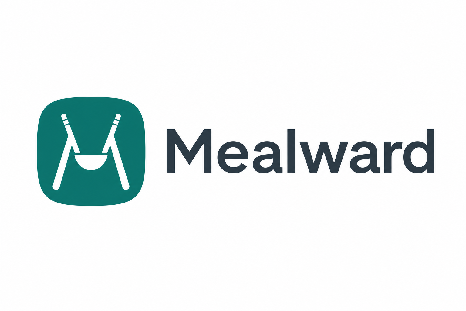
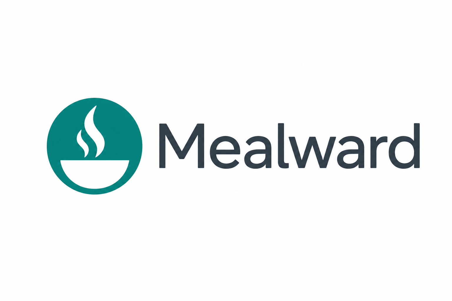
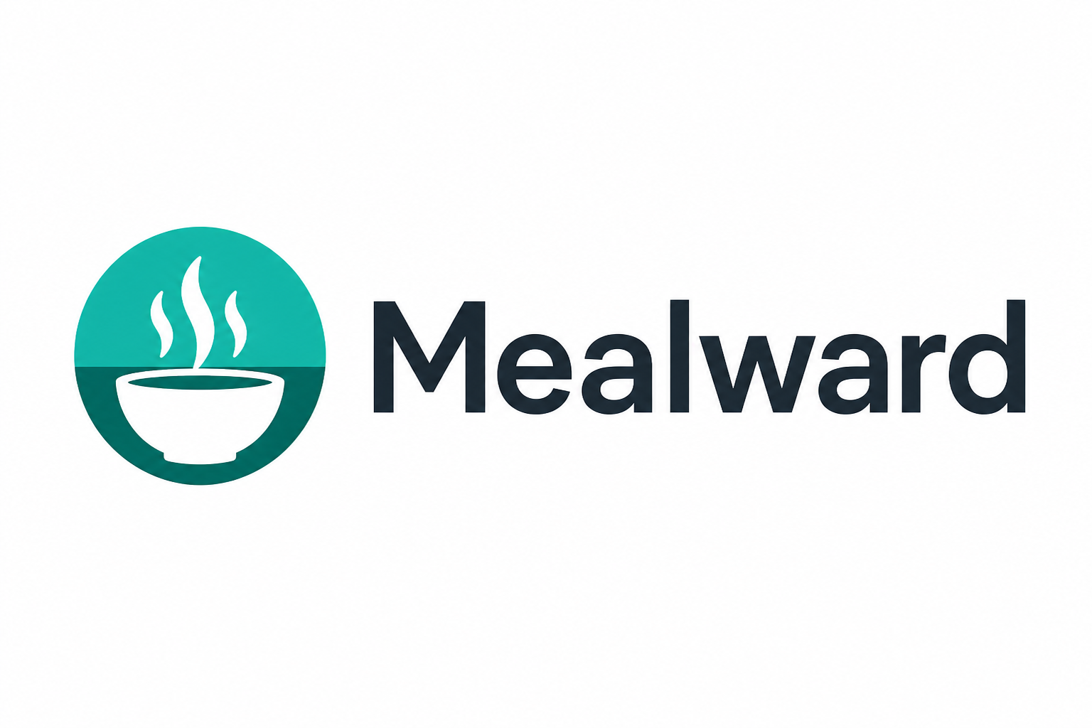
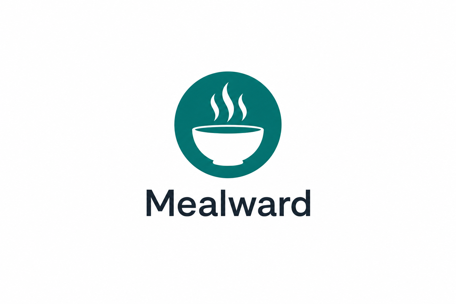
B2 chosen. Iterating.
Six logo iterations across three distinct directions. The owner has selected direction B2 (steam bowl) as the primary brand mark. The other variants below are kept for context. Refinement iterations and the final designer brief are at the bottom of the page.
Direction A - Pure wordmark
2 variantsType-led. The fastest to ship and the most flexible. Pairs cleanly with any product UI. Lowest risk choice.
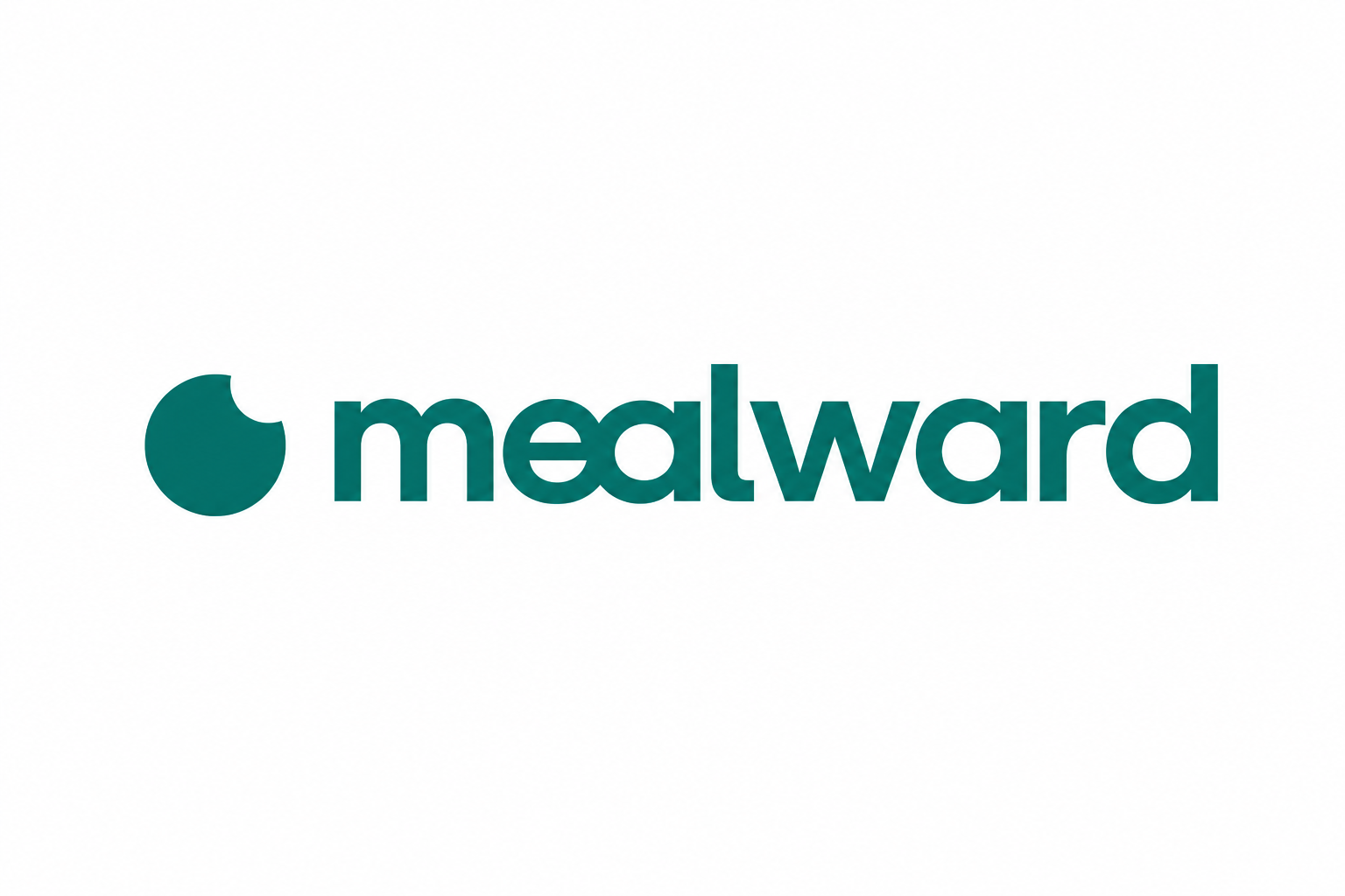
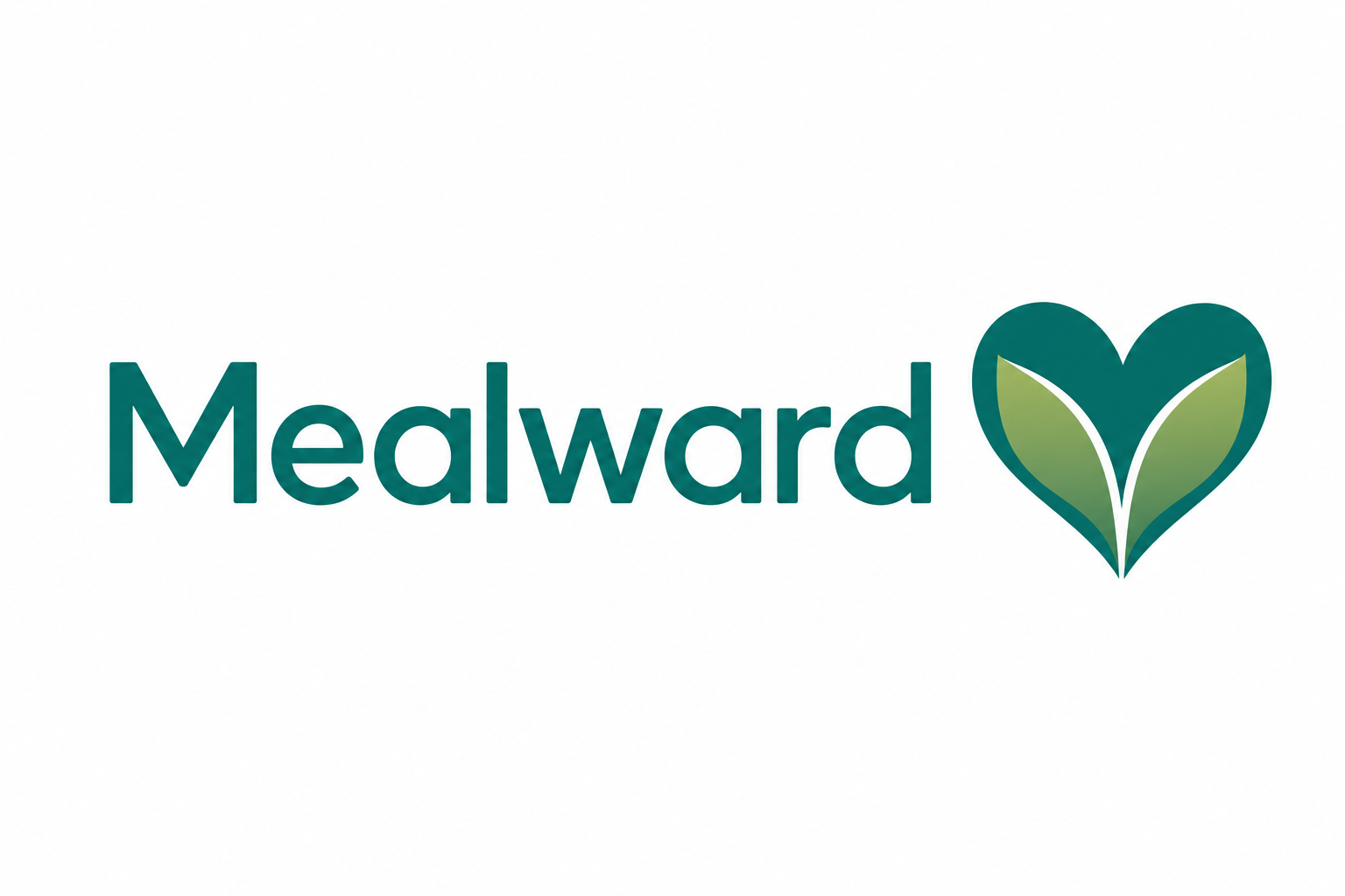
Direction B - Symbol + wordmark
2 variantsMost distinctive. A symbol gives you something to use as an app icon, favicon, social avatar, and pull-quote watermark. Higher upfront design cost.
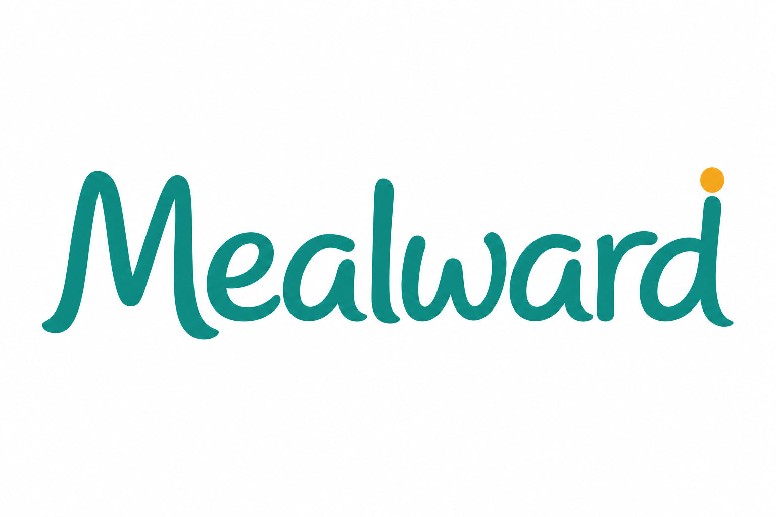
Direction C - Warm / hospitality
2 variantsMost warmth. Communicates care and food directly. Risk: can read 'residential' or 'wellness brand' instead of B2B SaaS - watch carefully against operator buyer expectations.
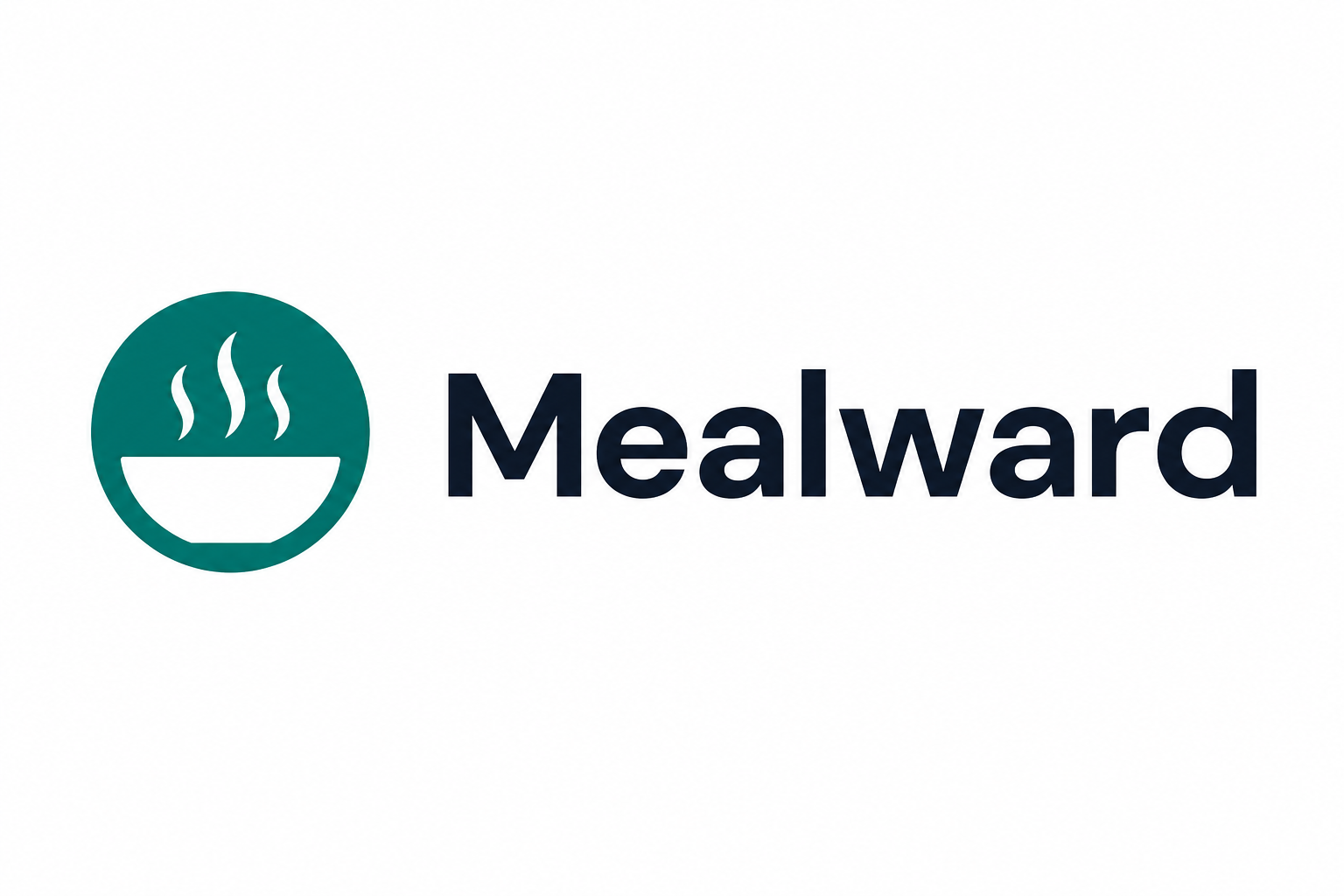
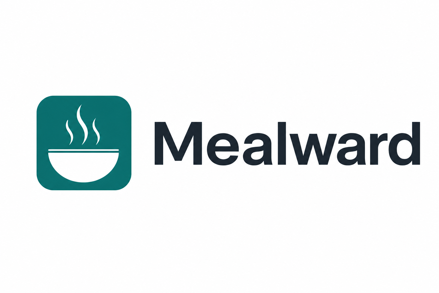
B2 refinements (selected direction)
4 variantsFour refined explorations of the steam-bowl direction to brief a real designer with. Each tightens the bowl proportion, the steam wisp count, and the wordmark pairing.
What we hand the designer
- Direction: B2 - steam bowl in a teal disc
- Recommended starting point: B2.1 (Clean wide bowl)
- Required deliverables: SVG (vector), 1024x1024 PNG, 512x512 PNG, 192x192 PNG, 32x32 favicon, dark-mode variant (white wisps + bowl on transparent), monochrome variant (single-colour for stamps / fax)
- Brand colours: primary teal #0F766E (Tailwind teal-700), light teal #14B8A6, slate-900 wordmark, amber #F59E0B accent
- Wordmark pairing: Inter Display 600 or DM Sans 600, slate-900
- Constraints: must be legible at 16px favicon size, must work as a single-colour stamp, must not look childish or clinical
Budget: ~$200 USD via Fiverr Pro or 99designs. Turnaround: 5-7 business days.